
How to Buy and Run a Route
Your definitive resource for valuing, buying, and operating logistics and service-based routes. Select an industry to explore our full library of expert-answered questions.
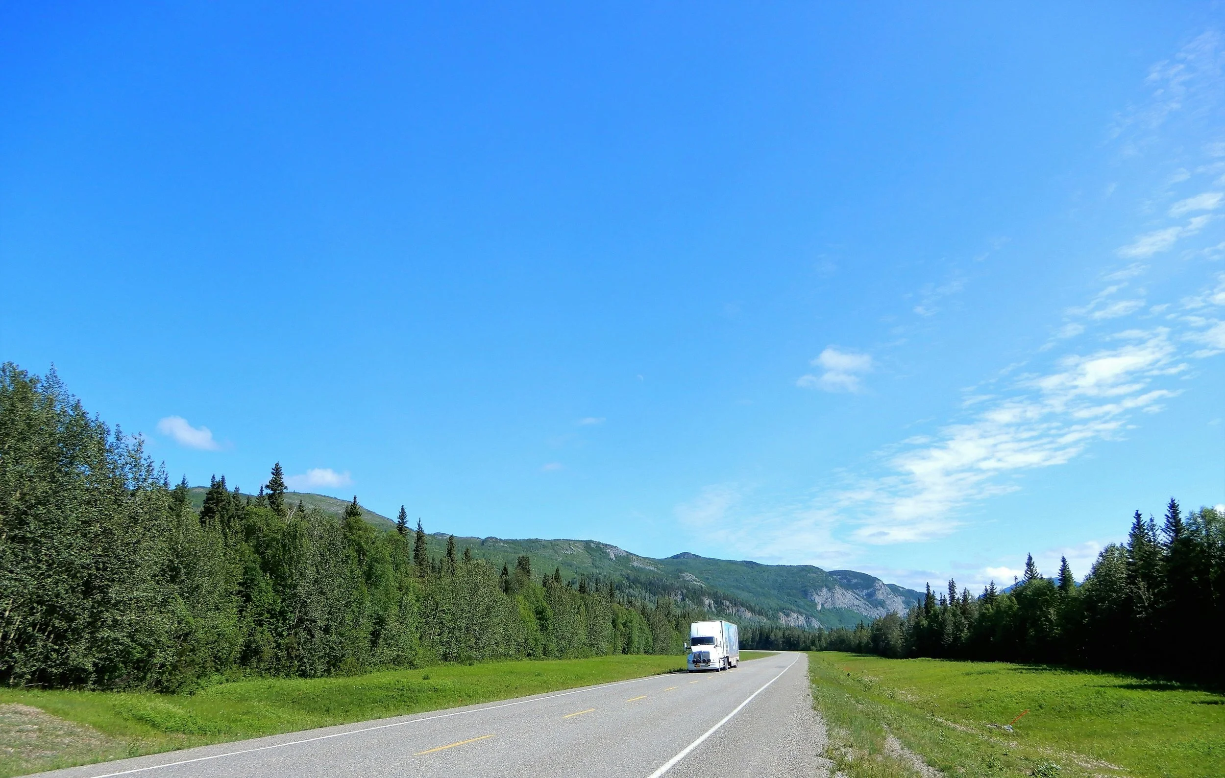
FedEx Ground
-
Pickup and Delivery (P&D) delivers packages to homes and businesses within a territory, whereas Linehaul carries trailers of packages from one hub to another.
Pickup and Delivery (P&D) refers to home and business package delivery. These are represented by the white FedEx delivery truck and driver who brings packages to your home. P&D contractors deliver all packages to residences and businesses within a set territory.
Linehaul (LH) refers to the tractor-trailor side of the business. These are the 18-wheeler freight trucks that carry trailers of packages from one hub to another across the country.
-
A standard estimation when financing a purchase is 20% of the asking price, plus $75,000 of working capital.
How much money you need up front is dependent on the price of the business, whether you are paying cash or financing, and if you need to purchase any trucks or equipment.
For Example:
If you are purchasing a business valued at $800,000, a 20% down payment for a loan would be $160,000 in cash. We recommend maintaining a minimum of $75,000 in working capital for any unexpected costs or emergencies. This means that for an $800,000 business, we would like to see at least $235,000 available in liquid capital.**This example does not account for additional cash you may need to purchase vehicles.
-
How much profit you can make is highly dependent on the size of your business and the efficiency of your business. A typical FedEx contracting business should net between 10% and 20% EBITDA annually.
The profitability of a FedEx business is entirely dependent on how well you operate the business. This space is unique in that you don’t have to market or worry about sourcing revenue. FedEx provides the volume and the revenue, and it’s up to you to deliver that volume as efficiently and safely as possible. An average FedEx business should earn somewhere between 10% and 20% EBITDA of Annual Revenue.
If a business averages $1M in Annual Revenue, then you can expect that business to net somewhere between $100k and $200k EBITDA in profit. Expenses such as personal income, debt payments, or fleet upgrades are then paid from that $100k to $200k. If you plan to supplement your income with your business, you need to make sure that the business can support your target income while still meeting the operational needs of the business.
Bread Routes
-
A bread route is a business that delivers baked good products, such as white and organic bread, to grocery stores, convenience stores, restaurants, and other accounts.
A bread route is a distribution business where an independent owner delivers and stocks baked goods to stores within an assigned territory. Most routes include exclusive rights, giving owners protected access to the accounts in their area. Here’s a concise breakdown of how they operate and why they’re popular.
How a Bread Route Works
Pick up fresh products from a warehouse or depot
Deliver to retail locations and rotate inventory
Maintain clean, attractive displays and full shelves
Start early in the morning and often finish by early afternoon
Territory Rights
Many routes include exclusive territories, preventing other distributors from the same bakery from selling to the same stores.
Why Bread Routes Are Appealing
Bread and baked goods are everyday essentials, providing steady demand
Offers a balance of independence and predictable income
Builds long-term relationships with stores and customers, creating a stable small business opportunity
-
Bread routes generate income through product sales and the commission—often called a discount—paid by the bakery. Owners earn a percentage of every item sold, making revenue directly tied to product sales in their territory. Here’s the concise breakdown:
How Commission Works
Bread route owners earn a percentage of each product sold.
Example: If a loaf costs $5 and the commission is 20%, the owner earns $1 per loaf.
Commission (discount) varies by bakery and by product type.
How Owners Increase Earnings
Adding new accounts within the territory.
Expanding shelf space or display opportunities in current stores.
Building strong relationships with store managers to secure better placement and sales opportunities.
For more details on how bread routes earn revenue, read How Does a Bread Route Profit?
-
The net income of a bread route typically ranges from 65-85% of net revenue.
Bread route profitability depends on sales volume, commission rate, and the route’s relatively low operating expenses. Most routes generate strong margins because revenue is steady and costs are limited.
Revenue & Commission
Gross annual revenue: Typically $250,000–$900,000 for a single route.
Commission rate: Usually 15–21%, taken as a percentage of every product sold.
Common Expenses
Fuel (generally low due to localized routes)
Vehicle repairs and maintenance
Insurance
Wages (only if a driver or helper is employed)
With limited expenses, most bread routes net 65–85% of their revenue, depending on sales strength, territory efficiency, and staffing needs. For more information, read How Much Money Can You Make Owning a Bread Route?
Amazon DSP Routes
-
To purchase an Amazon DSP business, you will need to pay cash for the full transaction price. You will also have other expenses such as incorporation fees and legal fees through the acquisition process. Buyers should also account for any needed equipment expenses and working capital for unexpected costs that may occur.
When calculating how much money you will need to acquire an Amazon DSP business, consider all of these variables. Route Consultant can help you determine what your total acquisition costs will be for a business you are interested in.
-
Amazon DSPs are paid directly by Amazon for the services they provide.
Amazon pays its DSPs a contract rate for every package delivered. Amazon provides a list of applicable charges in which the DSPs earn revenue for various services. DSPs who meet certain performance metrics receive additional compensation above and beyond the base pay rates. The most profitable DSPs are also those who consistently meet these metrics and perform above the base requirements.
-
EBITDA profit margins for Amazon DSPs typically range from 5% to 15% of Annual Revenue.
Your earnings as an Amazon DSP depend largely on how many packages you deliver and how efficiently you operate your business. Most DSPs net 5%–15% EBITDA profit margins, with top-performing operators sometimes exceeding that range. In short, profitability is driven by volume and operational efficiency, and strong cost control can push margins toward the higher end. The details below explain what influences your earnings.
What Determines How Much You Can Make
Package volume: Higher daily volume increases revenue potential.
Route efficiency: Strong dispatching, routing, and staffing lead to fewer delays and better margins.
Labor management: Driver productivity, retention, and overtime control are major factors affecting costs.
Fleet costs: Lease rates, maintenance, and downtime have a direct impact on profitability.
Operational discipline: Monitoring metrics, reducing waste, and staying compliant with Amazon’s performance standards all improve profitability.
What High Performers Do Differently
Optimize routes daily to reduce miles and time on road
Keep turnover low and invest in driver training
Track KPIs closely (on-time delivery, rescues, safety scores)
Maintain vehicles proactively to avoid costly repairs
Bottom Line:
While the typical DSP earns 5%–15% EBITDA margins, your actual profitability will depend on how well you control expenses, lead your team, and run the day-to-day operation.
For more information, check out our blog How Much Money Do Amazon DSPs Make?
Emergency Medical Services
-
You typically need $100,000 to $150,000 to start a small EMS or ambulance business with two vehicles.
Startup costs include the ambulance, medical equipment, licensing, insurance, and initial payroll. Most new operators reduce upfront costs by buying a used ambulance and financing it, rather than purchasing new.
You’ll also need working capital to cover 60–90 days of expenses before insurance reimbursements begin.
Costs can be higher depending on your location, staffing needs, and whether you’re launching a single ambulance or a fleet.
-
No, you do not need a medical degree or any clinical license to start and run an EMS business.
Medicine is required on the truck. but it’s optional in the owner’s chair. However, holding your own paramedic license gives you three big advantages:
Instant credibility with crews and clients
The ability to serve as backup during staffing conflicts
Deeper insight into protocol changes, drug shortages, and scope-of-practice battles that directly impact your bottom line.
Your main responsibilities as owner are hiring and retaining licensed EMTs/paramedics, securing vehicles and insurance, hiring and reviewing billing companies, and ensuring compliance with state and local protocols.
Additionally, the state issues the service license to the company, not to an individual practitioner. You will have a qualified Medical Director to oversee protocols, quality assurance, and credentialing of your clinicians.
-
Most small EMS and ambulance business owners can expect $60,000 to $150,000 per year in take-home profit once the business is stable.
In the first year, many owners earn $40,000 to $80,000 with one to two ambulances. As you scale contracts, increase call volume, and improve efficiency, profits can grow to $120,000+ per year.
Profit potential varies by location. Urban markets often generate higher volume and reimbursement rates, while rural markets may have lower volume but less competition and lower operating costs.
Typical net profit margins in non-emergency EMS transport are 10% to 20%, with revenue driven by transport volume and reimbursement rates.
Waste Services + Garbage Removal
-
Most Waste Management operations can net an EBITDA margin of 20-30% of Annual Revenue.
The EBITDA margin potential of Waste Management routes is highly dependent on the specific services you provide and how efficiently you operate the business. The average expected margin range is 20-30% of Annual Revenue, while certain specialized waste services can achieve even higher margins.
Residential Routes: These tend to have lower margins, often in the 15-25% range, because of lower densities, more stops per unit revenue, and higher trucks/fuel per stop.
Commercial Routes: Higher margin potential, average margins around 30-35% for well-run operations with strong customer contracts.
Industrial or Specialized Routes: These can command margins in the 35-40%+ range, due to higher-value service, less competition, and specialized handling requirements.
-
Startup costs for a waste management business vary widely, but most new operators should expect anywhere from tens of thousands to several hundred thousand dollars, depending on equipment, route size, and whether they’re buying an existing business or starting from scratch.
The amount of money you need depends heavily on whether you purchase an existing operation or build your own from the ground up. Existing businesses come with routes, equipment, and revenue, while startups require more upfront spending on trucks, containers, and customer acquisition.
In short, buying an existing business requires a significant upfront investment or financing, while starting from scratch typically involves larger equipment purchases and higher early marketing costs. The details below will help you estimate your specific needs.
Costs When Purchasing an Existing Business
Acquisition price: Your largest expense; varies based on route density, customer mix, and equipment age.
Down payment: Typically 10–20% of the asking price if financing the purchase.
Additional expenses:
Transfer fees or legal fees
Equipment upgrades or replacements
Working capital for payroll, fuel, and operations during transition
Costs When Starting From Scratch
Equipment:
Compactor or rear-load trucks
Roll-off trucks (if offering dumpster service)
Dumpsters, carts, and waste containers
Startup infrastructure:
Insurance, permits, and facility space
Software for routing, billing, and customer management
Marketing & growth:
Branding, advertising, and community outreach
Early recruiting and training for drivers or helpers
Factors That Influence Your Total Investment
Residential vs. commercial routes
Service type (cart service, dumpster service, roll-off, recycling)
Financing structure and interest rates
Local disposal fees and dump or transfer station costs
Professional Support
You don’t need to navigate the process alone. Route Consultant can guide you through evaluating opportunities, understanding costs, and choosing the path that fits your financial goals.
-
Waste Management companies use either a transfer station or a landfill to dump waste.
Companies pay a fee to dump their collected waste at designated landfill sites. If a landfill is too far away to efficiently dispose of the waste directly, then a transfer station can be a more affordable option. Transfer Stations are simply midway points that collect and sort the waste before shuttling it to the landfill. Where you dump your waste is determined by the proximity of your territory and the disposal costs. Your disposal costs is one of the variables that affect how much you have to charge customers. Your job as the owner is to determine which options are available to your business and what the most cost-effective option is.
Vending
-
A vending business is a flexible, scalable operation where you own machines that sell products like snacks or drinks, manage restocking and placement, and can grow without a storefront or employees.
A vending business is a simple, automated way to sell products, from snacks and drinks to tech accessories and personal care items. As the owner, you choose your machines, place them in high-traffic locations, stock inventory, and maintain equipment. Here’s why vending is an attractive business opportunity and how it works:
Business Model
You own machines that automatically sell products without needing employees.
Revenue comes directly from the products sold in each machine.
Operators manage placement, restocking, and maintenance.
Scalability and Flexibility
Start with one or two machines and expand as you learn the business.
No storefront, no large staff, and no prior experience required.
Work schedule and route size are completely under your control.
Industry Opportunity
The global vending industry is projected to reach $146 billion by 2027.
Growing demand across snacks, drinks, healthy foods, and convenience items makes it a strong opportunity for new entrepreneurs.
-
On average, a vending machine generally earns $200 to $300 per month but can be higher or lower depending on location and product mix.
Vending income can vary widely depending on location quality, foot traffic, product mix, and how many machines you operate. Most operators start with modest earnings and scale up as they secure stronger locations.
Average Earnings per Machine
$200–$300 per month is the industry average for a standard snack or drink machine.
Strong, high-traffic locations can earn $400+ per month per machine.
Machines with card readers or premium placement often outperform these averages.
Scaling to Real Income
Operators aiming for meaningful cash flow typically grow to 10–15 machines, which can generate consistent recurring income.
Each added machine becomes another predictable revenue stream, making scaling straightforward.
Industry Opportunity
The vending industry generates over $8 billion annually, showing strong ongoing consumer demand.
With smart placements, modern machines, and good product rotation, operators can significantly increase monthly revenue and long-term profitability.
For more information, read Startup Costs, Profit Potential, and Financing Your Vending Business.
-
Starting a vending business can cost just a few thousand dollars for one or two used machines up to $10,000–$15,000 for multiple machines, plus a small budget for inventory, permits, and insurance.
The vending industry is one of the most budget-friendly ways to start a business, and your total startup cost depends on how many machines you want to launch with. Many new operators get started for just a few thousand dollars, especially if they begin with used equipment and a small inventory. Here’s a clear breakdown of startup costs.
Machine Costs
Used machines: Typically $1,500–$5,000 for one or two machines.
New machines: Usually $3,000–$10,000 each, depending on features such as card readers, refrigeration, or combo setups.
Inventory & Setup
Initial product inventory: Around $200–$1,000, depending on machine size and product mix.
Other costs: Permits, insurance, and occasional installation or delivery fees.
Scaling Your Investment
Many beginners start with one machine, learn the business, and reinvest profits to grow.
If you prefer to launch with multiple machines right away, expect to invest around $10,000–$15,000 to start at a small scale.
Ready to Make a Move?
-
Get Started for Free
Enroll in our free 101 courses to learn the fundamentals of these route-based operations.
-
Find Your Business
Browse the 250+ active listings across the US.
-
Join the Community
Register now for free events tailored for operators and new investors.
-
Still Have Questions?
Contact our team to learn more about route operations.
Stay ahead of the curve with Industry Insights. Join our weekly conversation on YouTube for real-world strategies and expert interviews.